When I think of Persian and Iranian art and architecture, I think of color (Rang in Persian/Farsi) before I think of anything else. I think of turquoise tile against warm brick, red carpet fields filled with flowers, and small details that ask for a closer look. Color is not an afterthought in these works. It carries place and memory.
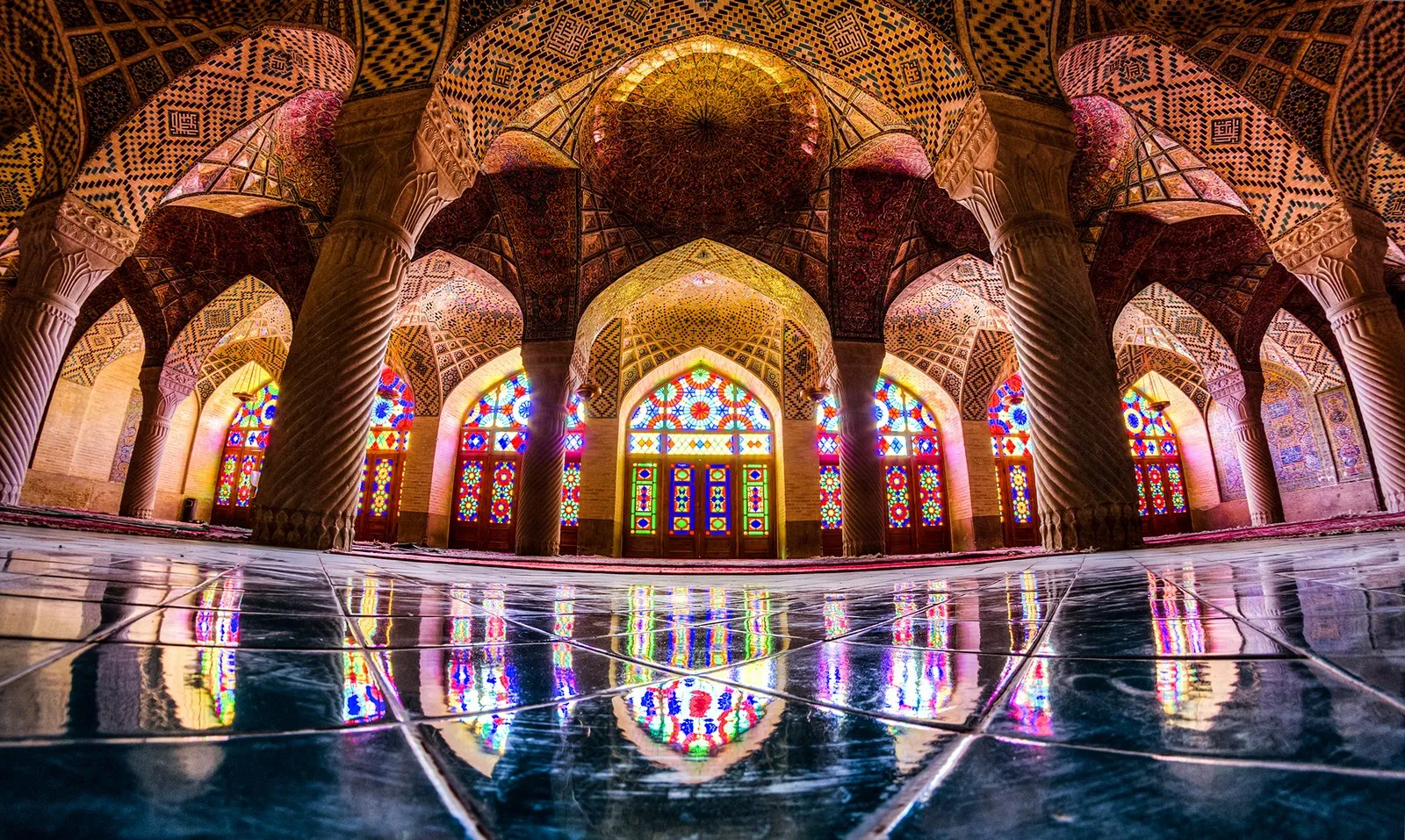
The interior of Nasir ol Molk Mosque in Shiraz (where I was born) makes it impossible to miss the beauty of colors and their interactions. Morning light passes through colored glass and lands on stone, tile, and carpet. The room changes with the sun. Color becomes something you can almost feel, as if you were touching it.
My daily work involves reviewing large amounts of water, hydrologic, and hydraulic data. I move between rainfall grids, terrain models, stream networks, flood depths, water surface elevations, and results from hydrologic and hydraulic models. Some maps cover a watershed. Others cover a state or most of a continent. Some are meant for a quick technical check. Others need to explain a result clearly to someone who did not build the model.
In my engineering work, color has a task. It needs to help me see where rain is heaviest, where the ground rises, which channel carries the main flow, and how water depth changes across a floodplain. A weak color scale can hide structure or make ordinary variation look more pronounced than it really is. A good one lets the shape of the data show itself clearly.
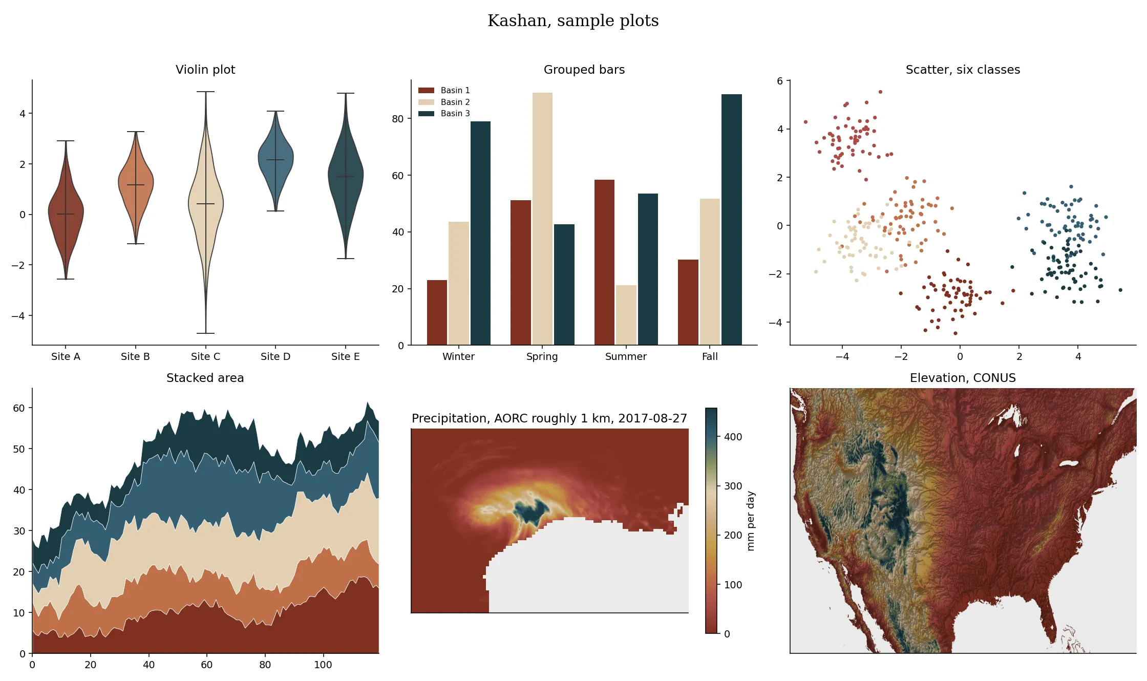
The default color palettes often work, but to me, Persian and Iranian carpets, tilework, manuscripts, and textiles hold centuries of experience in placing colors next to one another. I wanted to bring some of that historical visual intelligence into the maps I make.
After seeing Josh Carrell share his Grateful Dead album color schemes, I was inspired to share my own work. That idea became Rang. Rang means "color" in Persian. It is a growing collection of palettes drawn from Persian, Iranian, and Persianate art and culture and prepared for data visualization.
How do you pull a palette from a photograph?
Picking colors from a photograph sounds easier than it really is. Open a photograph and pick a few colors? No. I am an engineer, so I need to make it more rewarding. A photograph may contain millions of pixels. Light changes across the surface. Old fibers fade unevenly. Shadows darken one corner. A camera and a screen both add their own character. Even a small flower may contain dozens of reds.
My goal was not to recover a single, mathematically correct answer. There is no such answer. The goal is to use measurement to see and appreciate the photograph more carefully, then make a palette that feels faithful to the work and remains useful on a map.
The Kashan palette is a good example.
Step 1: Start with the artwork
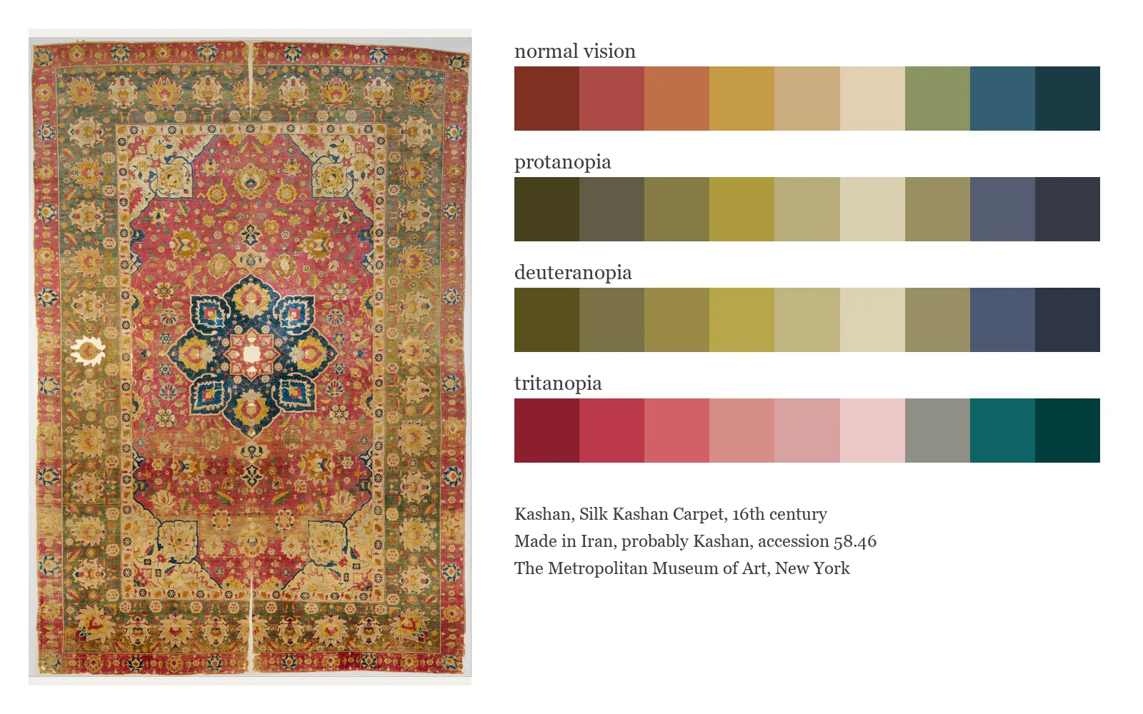
Kashan comes from a sixteenth-century silk carpet in the collection of The Metropolitan Museum of Art. The carpet has a rose field, an indigo central medallion, pale borders, gold details, and touches of green and blue.
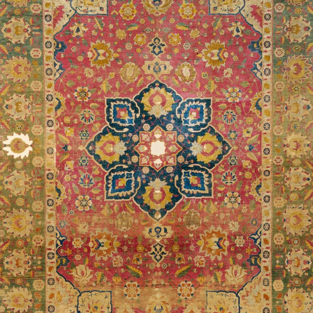
If I asked a computer for the most common colors in the whole image, the rose field and tan border would dominate. The small indigo and ivory details could almost disappear from the result, even though they are essential to how the carpet looks.
Step 2: Look region by region
Instead of treating the carpet as one bag of pixels, I divide it into visual regions. For Kashan, useful regions include the rose field, the central medallion, and the outer border.
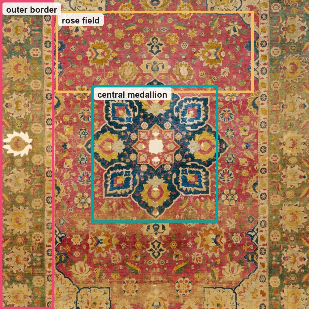
This is an important choice. It tells the computer to listen to quiet parts of the artwork as well as loud ones. It also makes the process personal. Another person might draw the regions differently because another detail caught their eye. That is not a mistake. Looking is part of the method.
Step 3: Describe color in CIELAB
Screens normally store color as red, green, and blue values. Those values are good for displaying light, but numerical distances in RGB do not line up very well with the differences people see. CIELAB is a mathematical color space defined in 1976 by the International Commission on Illumination (CIE) to describe all colors that humans can see. It is device-independent, uses three numerical coordinates (L*, a*, b*), and models how the human brain perceives color differences.
For clustering, I convert the sampled pixels to CIELAB, usually shortened to Lab. This color space describes a color with three values:
L*represents lightness, from dark to light.a*moves roughly from green to red.b*moves roughly from blue to yellow.
The useful idea is simple. In Lab, colors that are numerically closer tend to look closer to us. It is not a perfect model of human vision, but it gives the clustering a better foundation than raw RGB values. The formal definitions come from the CIE colorimetry standard.
Step 4: Let k-means find groups
Within each region, I use an algorithm called k-means. The k-means algorithm is a popular unsupervised machine learning method that groups unlabeled data into k distinct clusters. Read this article if you really, really want to know more about it.
I asked ChatGPT to help me explain how k-means is used here with an analogy. Here is what it told me, and I actually think it is a great analogy:
Imagine pouring the pixels onto a table as colored beads. The algorithm places a small number of empty bowls on the table, moves every bead toward its nearest bowl, then moves each bowl toward the center of the beads it collected. It repeats those steps until the groups settle down.
Each final bowl gives one cluster center, a representative color for a group of similar pixels. Running the process separately for each region gives a set of candidates from the rose field, another from the medallion, and another from the border.
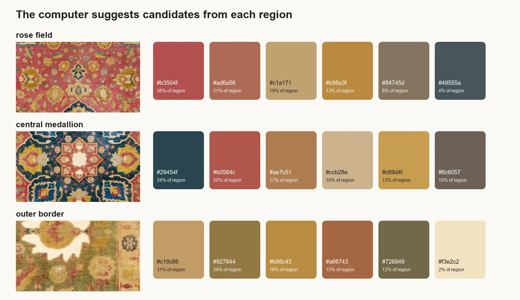
The percentages show how much of that region belongs to each cluster. A color covering two percent of a region may matter more to the design than a background color covering thirty percent. It is all about what you think is important.
Step 5: Put the human judgment back in
This is where extraction ends and palette making begins.
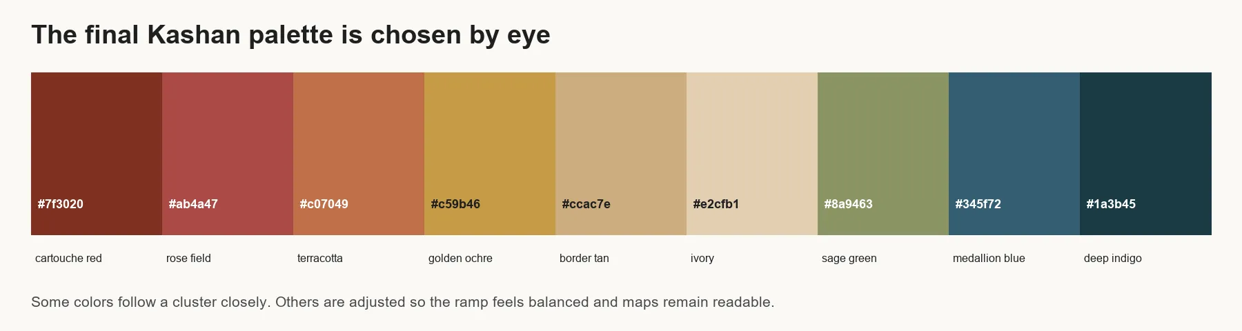
I compare the candidates with the carpet. I keep colors that carry its character. I adjust a color when the cluster center looks muddy. I may leave out a common color that adds little to the palette. I may lift the lightness of another so it remains visible in a map. Then I arrange the colors so they make a satisfying path when used as a continuous ramp.
This part is deliberately not deterministic. The software does not get the last word. My eyes do. The final palette needs to belong to the artwork, feel good as a group, and behave well when it carries actual data.
Step 6: Test it on real data
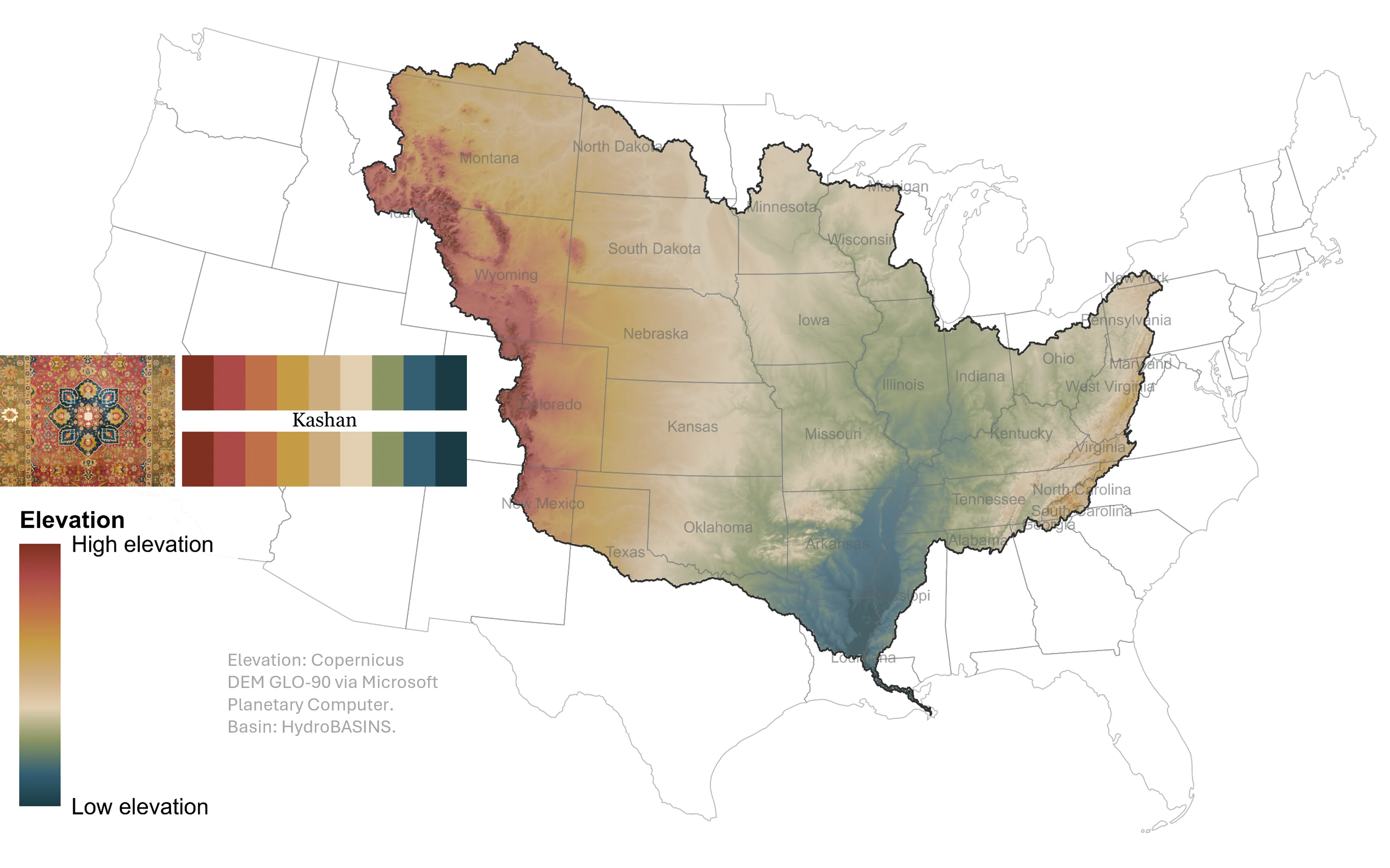
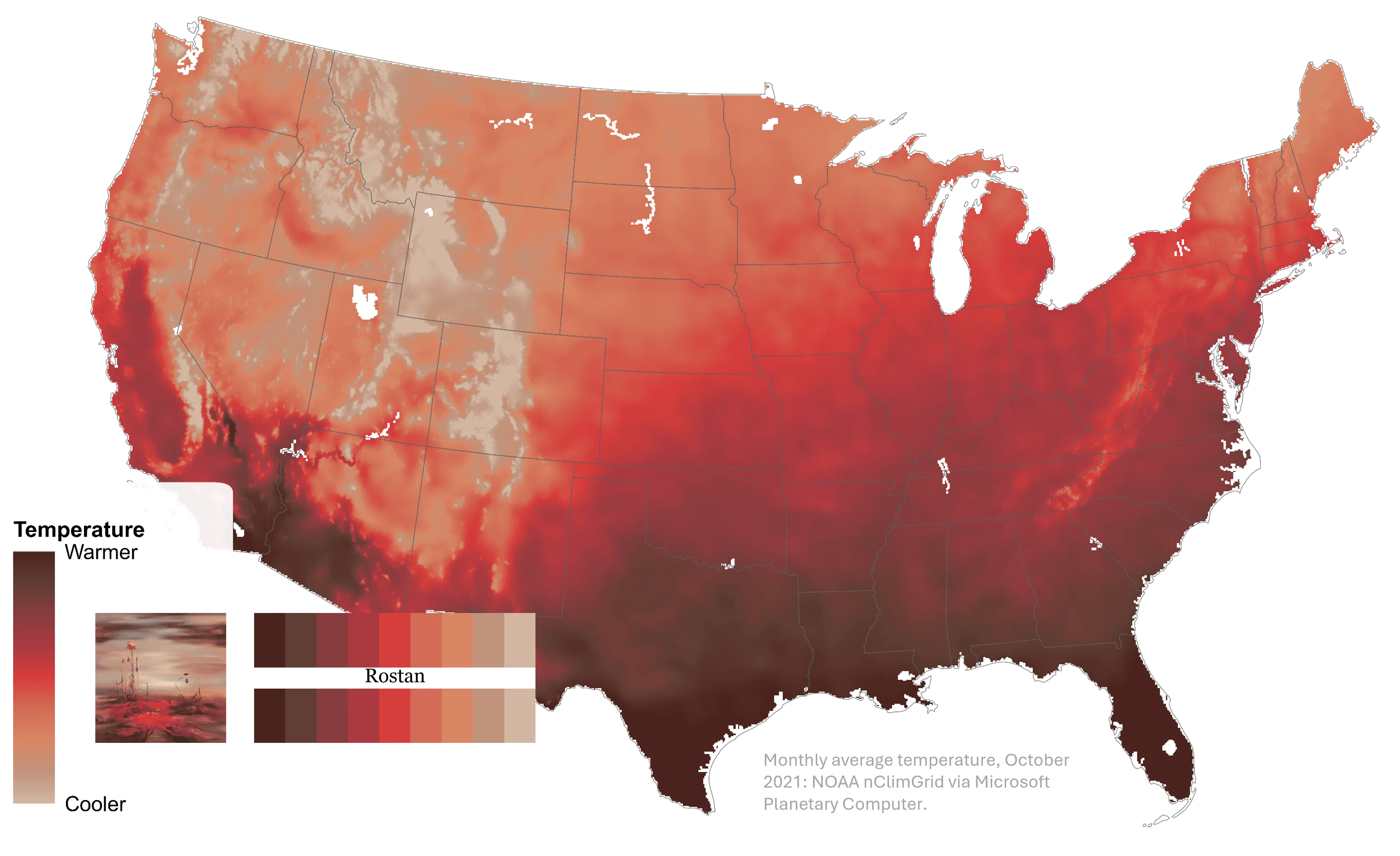
A row of color chips can be beautiful and still fail as a visualization. I test each palette on categorical plots, continuous surfaces, and real map data. I look for neighboring colors that collapse into one another, abrupt jumps in a gradient, and dark colors that hide labels or boundaries.
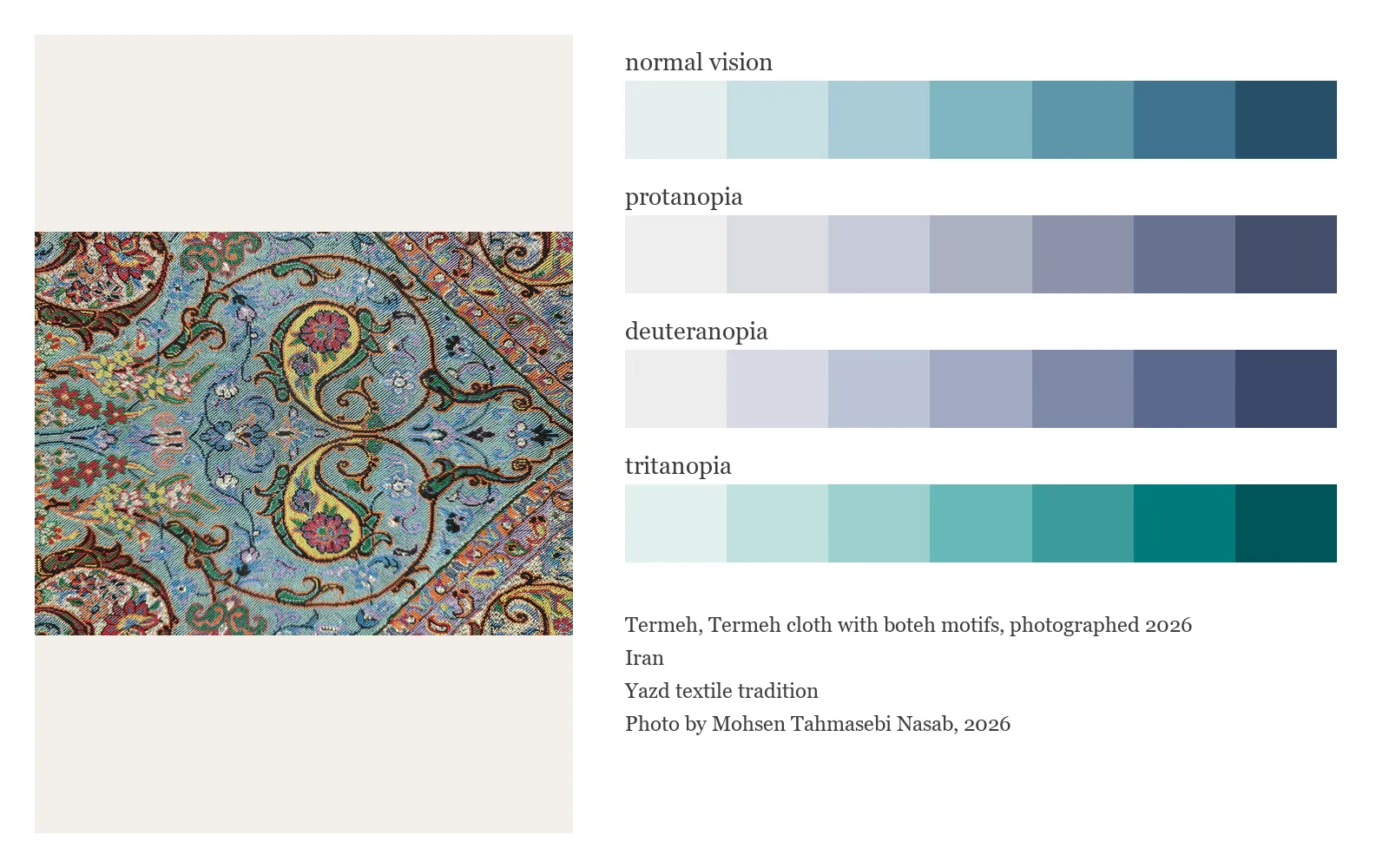
Rang also measures pairwise color separation under normal vision and simulated protanopia, deuteranopia, and tritanopia. Those checks do not turn a palette into an accessibility guarantee. They do show problems that are easy to miss. Again, the numbers support the visual decision. They do not replace it.
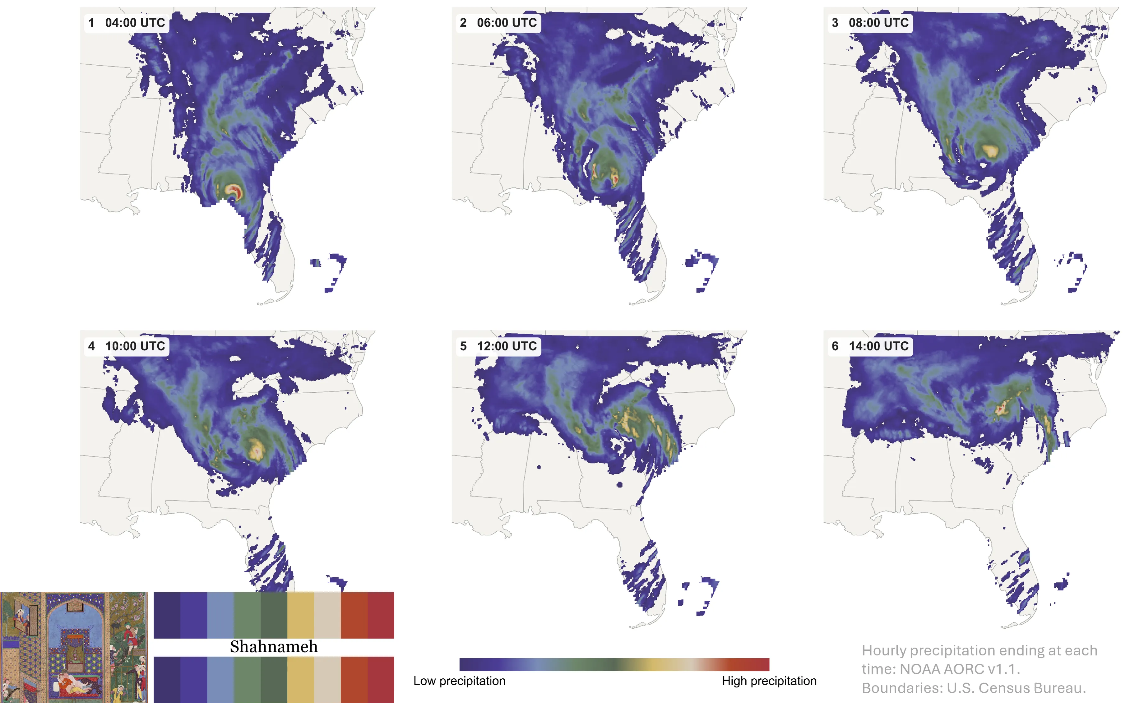
Three palettes to begin with
Rang began with three sources, each with a different personality and grew to include more artwork.
Kashan
Kashan moves through brick red, rose, terracotta, ochre, ivory, sage, blue, and indigo. It came from the structure of a silk carpet and works well for both groups and continuous surfaces.
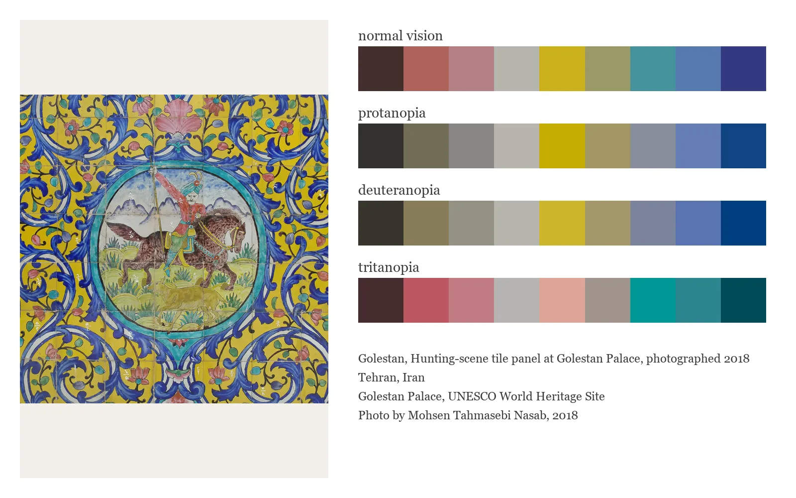
Golestan
Golestan came from a hunting-scene tile panel at Golestan Palace in Tehran. I photographed it in 2018 when I was visiting the palace.
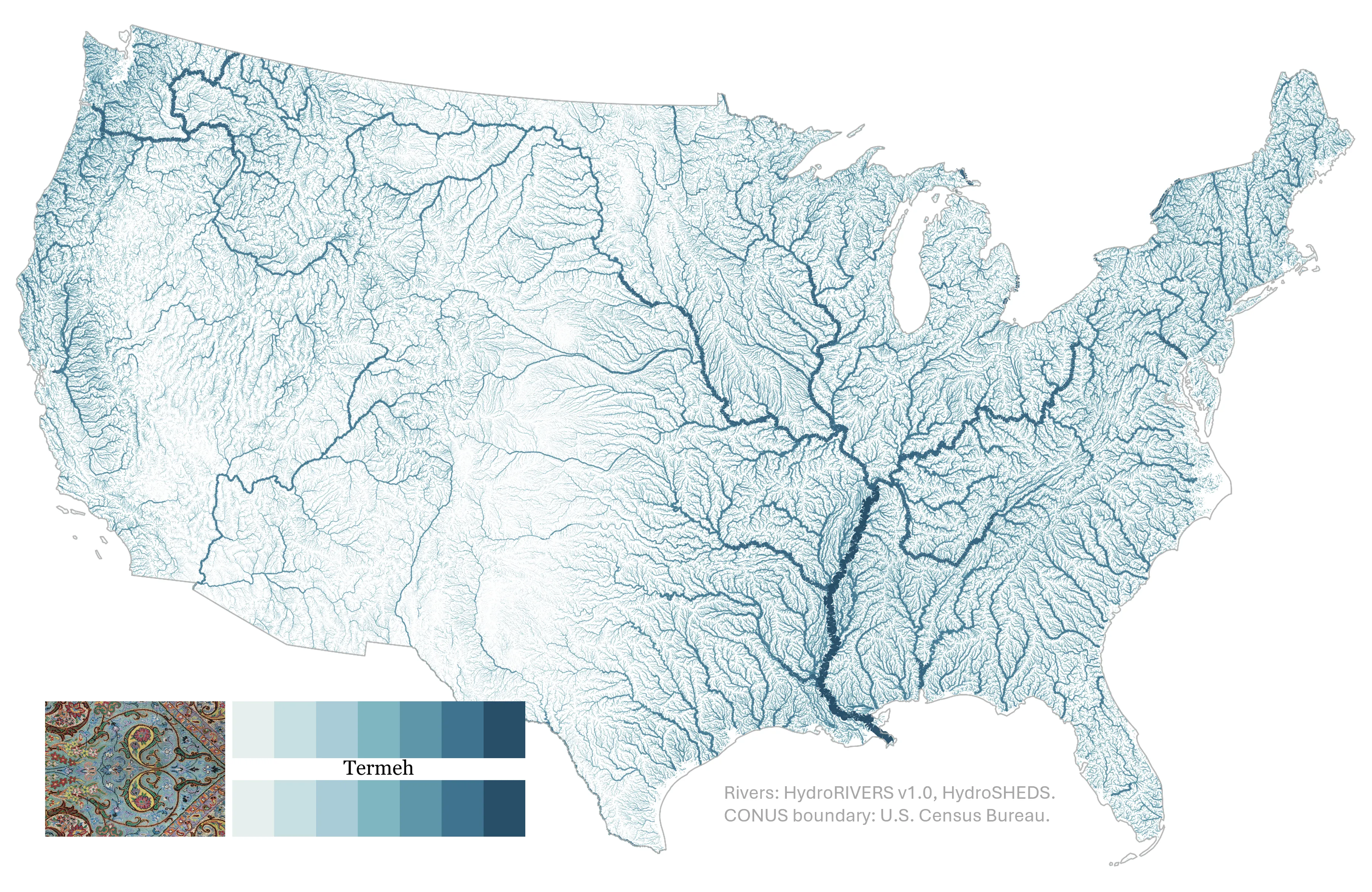
Termeh
Termeh came from a patterned textile associated with Yazd, which I purchased in 2022. I built this one as a sequential water palette, moving from a pale foam color through river blue to deep indigo. I developed this one for my hydraulic modelers out there who want to visualize water depth and water surface elevation maps.
From an artwork to the tools I already use
I did not want Rang to remain a collection of hex codes in a notebook. The palettes are now packaged for several common workflows:
- Python and matplotlib
- R and ggplot2
- ArcGIS Pro
- QGIS
- GeoLibre
- HEC-RAS and RAS Mapper
The same palette definitions generate all of these outputs, which keeps the colors consistent from one program to another. The repository also includes sample maps, source notes, color-vision checks, and some of the tools used to build a new palette.
You can explore the project, install the packages, and download the GIS files at github.com/mohsennasab/Rang.
Rang should grow beyond the works that first caught my eye. If you love Persian, Iranian, and Persianate art and culture, I would be glad to see what you notice. A carpet from your city, a family textile, a manuscript, a tile panel, or a piece of architecture may hold the next palette. Bring the photograph, bring your knowledge of the work, and bring your own sense of color. The contribution guide included in the repository explains how to turn that beginning into something other people can use in their maps. Find my email under contact section of this page and reach out with your ideas!
I hope Rang gives you one more reason to look closely.
Mohsen :)